

Stop Guessing. Start Selling. Build an Amazon listing that Converts.
By: Lindsay Toth
Launching on Amazon is a big moment for a food founder. It often signals that your business is growing, your distribution is expanding, and your brand is ready for a larger audience.
But there is something many founders learn the hard way.
Being on Amazon does not guarantee sales.
The brands that win are not always the ones with the best product. They are the ones with the clearest, strongest listing.
Your Amazon page is not just a product page. It is your salesperson. Your merchandiser. Your first impression. And it has about three seconds to do its job. If your listing creates confusion, shoppers move on. If it creates confidence, they buy. Let’s walk through how to build a listing that actually converts.
Start With How Amazon Shoppers Actually Behave
Amazon is not a browsing platform. It is a decision platform.
Most shoppers are:
Comparing several products at once
Scrolling quickly
Looking for signals they can trust
Making fast, low emotion decisions
Many purchases happen before a shopper reads a single bullet point. Your images are doing most of the selling.
This is why clarity matters more than creativity. On Amazon clear beats clever every time.
Your Images Are Your Strongest Conversion Tool
Before we get tactical, remember this:
Traffic is expensive. Conversion is leverage. A small lift in conversion can outperform a large increase in ad spend. Strong creative is one of the fastest ways to improve performance.
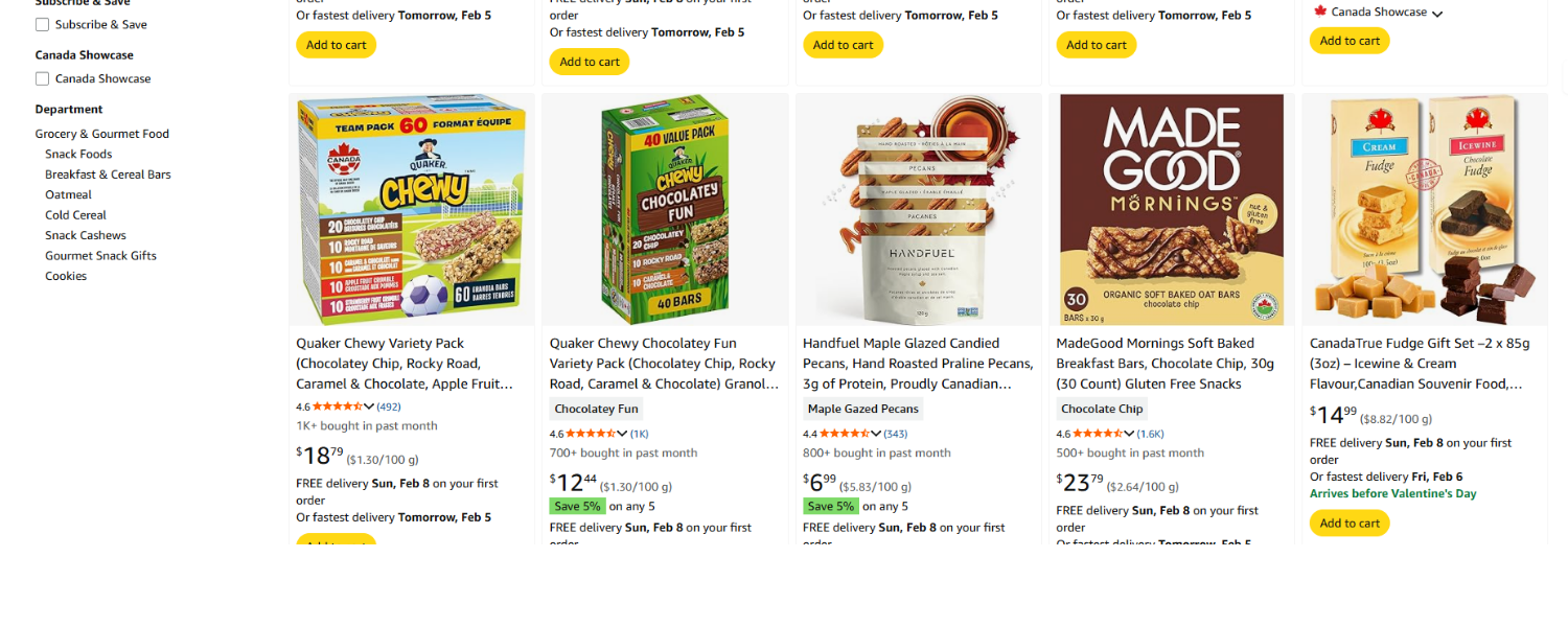
Amazon Listing Page
The Image Order That Drives Sales
One of the biggest mistakes founders make is leading with brand story.
High performing listings lead with shopper needs.
Here is a sequence that works.
Image 1: The Scroll Stopper
Your main image has one job. Get the click. A shopper should understand what your product is in less than a second.
Best practices:
Pure white background
Product fills about 85 percent of the frame
Bright, professional lighting
No props
If your packaging is hard to read at thumbnail size, your click through rate drops. A common mistake is treating the main image like a lifestyle photo. It is not branding space. It is performance space.
Image 2: Show the Outcome
Shoppers are not buying granola. They are buying an easier morning. Better nutrition. A routine that feels good.
Your second image should answer a simple question. How does this make my life better?
Show the prepared product. Highlight texture. Use natural lighting. Make it look appetizing.
Emotion speeds up decisions, especially with food.
Image 3: Make Your Benefits Easy to Scan
Amazon is skim behaviour. Long explanations do not work here. Focus on 3 to 5 key benefits. Use large fonts and simple icons so shoppers can understand your value instantly.
Examples might include:
High protein
Gluten free
No added sugar
Plant based
Made in Canada
If a shopper has to work to figure out why your product matters, you will lose them.
Image 4: Prove What Makes You Different
By now, shoppers are comparing you to other options.
Do not just claim quality. Show it.
Strong differentiators might include functional ingredients, cleaner labels, better sourcing, or nutritional advantages. Today’s consumers are skeptical. Evidence builds trust much faster than marketing language. Proof is what moves a shopper from considering to purchasing.
Image 5: Remove Any Purchase Friction
Confused shoppers rarely convert. Unclear expectations also lead to returns.
Use this image to answer practical questions:
How big is it?
How many servings are included?
What exactly will arrive?
How is it used?
When you remove uncertainty, you make it easier for shoppers to say yes.
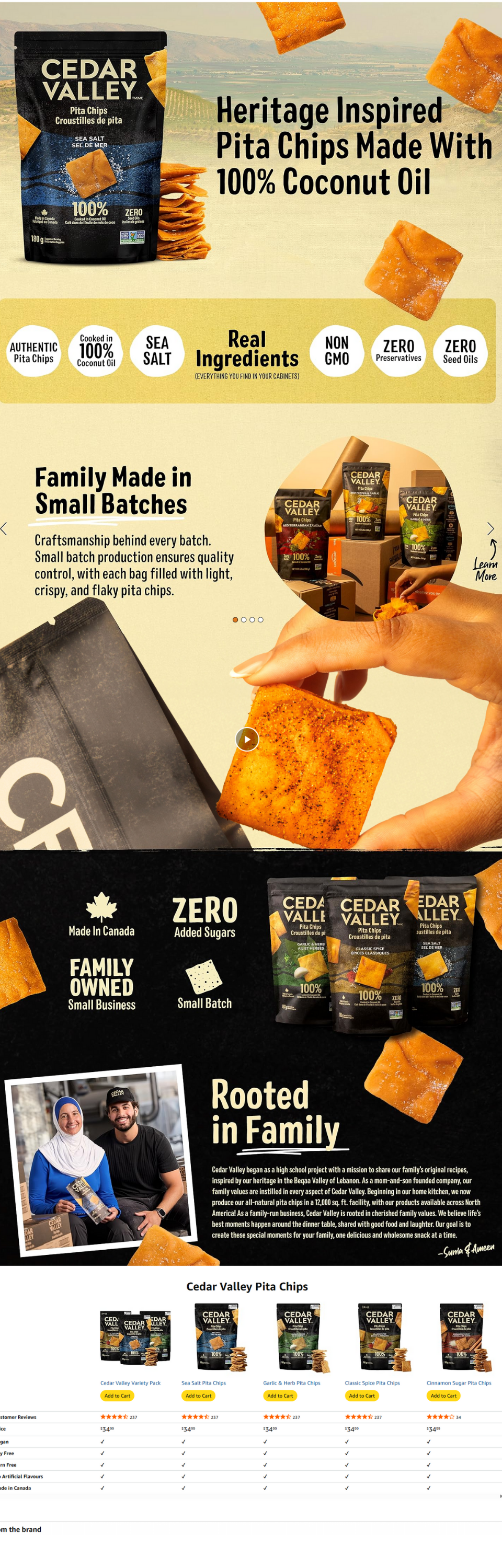
Cedar Valley A Plus Content Example
Do Not Overlook Premium A+ Content
Premium A+ content is often underused by emerging brands, yet it gives you space to deepen trust and win the comparison.
You can include up to seven modules.
A strong structure looks like this:
Hero banner that elevates the product
Expanded benefits
Ingredient or quality story
Comparison chart
Usage ideas such as recipes or pairings
Brand credibility
Cross sell opportunities
Think of A+ as a mini landing page inside your listing. Keep it consistent, easy to read, and focused on helping shoppers feel confident in their decision.
Conversion Principles Every Founder Should Know
There are a few patterns that show up again and again in high performing listings.
Design for speed. Shoppers scan. Make your message obvious.
Stick to one message per image. When everything is important, nothing stands out.
Choose clarity over cleverness. Do not make shoppers interpret your visuals.
Answer objections early. Will it taste good? Is it worth the price? Is it healthy? Your images should handle these questions before they are even asked.
Build trust before asking for the sale. Transparency shortens buying time.
Try the Five Second Test
Open your listing and look at it for five seconds.
Ask yourself:
Can a stranger immediately tell what this product is?
Is the main benefit obvious by the second image?
Do I communicate a clear difference from competitors?
Does this feel credible?
Would I stop scrolling?
If the answer to any of these is no, there is friction. And friction costs you sales.
A Hard Truth Worth Remembering
On Amazon, pretty does not win. Clear wins. Different wins. Trust wins fastest.
Your listing is not decoration. It is revenue infrastructure.
When you invest in strong creative early, you improve conversion, lower acquisition costs, and build momentum faster. In a competitive category like food, that advantage compounds quickly.
Do not aim to simply look professional. Aim to make the decision effortless.
Because when you remove hesitation, you do more than increase sales. You build the kind of confidence that leads to repeat purchases, stronger reviews, and long term brand growth.
